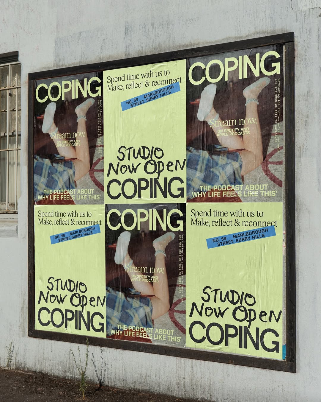
monochrome brutalism, heavy typography, neon accents (slide 1 of 10)
monochrome brutalism, heavy typography, neon accents (slide 3 of 10)
monochrome brutalism, heavy typography, neon accents (slide 4 of 10)
monochrome brutalism, heavy typography, neon accents (slide 6 of 10)
monochrome brutalism, heavy typography, neon accents (slide 7 of 10)
monochrome brutalism, heavy typography, neon accents (slide 9 of 10)
monochrome brutalism, heavy typography, neon accents (slide 10 of 10)
1 / 10

Brand crush

@thebrandidentity

#conversational-typographymonochrome brutalism, heavy typography, neon accents

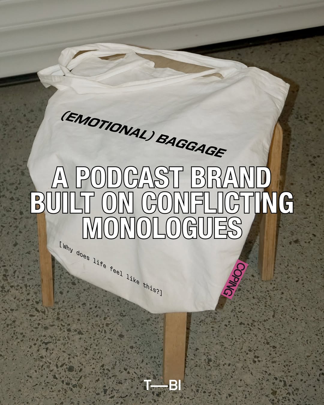
Look at the stark black ink sinking into the unbleached cotton, completely ignoring traditional logo placement. The heavy typography turns a standard tote into an editorial piece, while that hot pink woven hem tag acts as the only visual anchor.
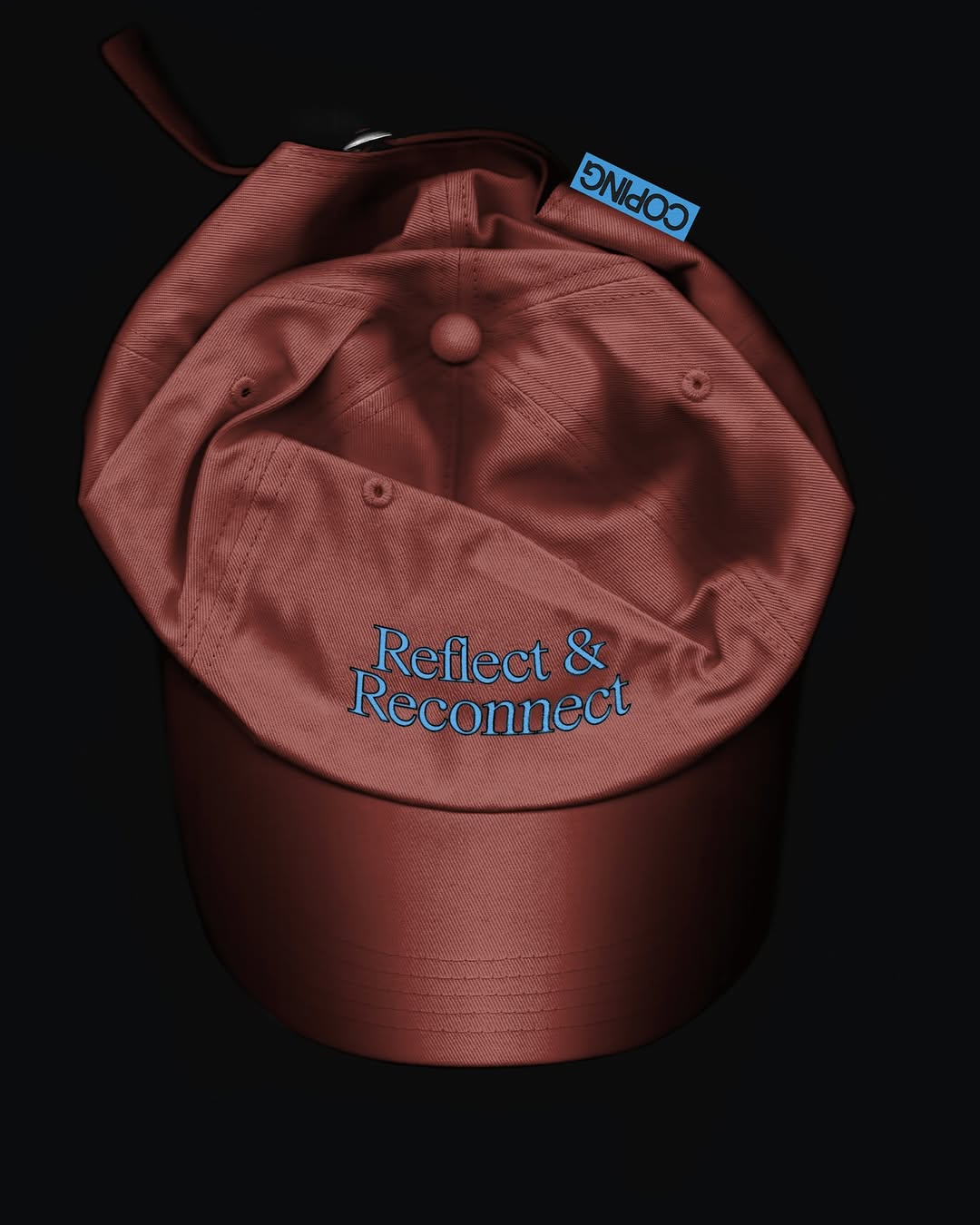
The portable idea

Notice how dropping the logo entirely in favour of a relatable internal monologue turns a basic item into editorial commentary. If you push the actual brand real estate to a single, high-contrast woven label on the seam, people are far more likely to actually wear the piece. We can run a mockup on a canvas piece to show you how a stark typographic approach changes the whole feel.

20 May 2026spotted via @thebrandidentity

Steal this for your brand world

Findie's translation of the move above into specific Sense2 products by industry. Pick the row that fits your brief — pricing is per piece at minimum order quantity.

Three more from the studio

More moments worth a look.

Want something like these?

Ask Findie for a quick conversation, or hand the brief to Susan and the team. Either works.