Brand crush
@sense2lovesbranding
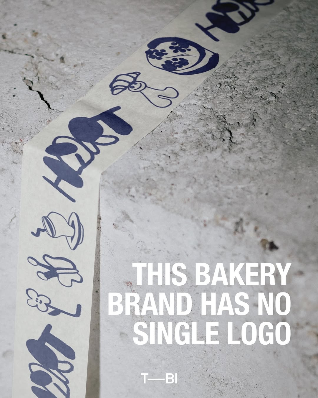
#macro-tonal-graphicsbotanical minimalism, tonal green palette, organic modern
The heavy dark green fabric acts as an anchor for a massive, tonal flood of lighter green ink, pushing the actual text into a tiny top corner. By letting organic shapes dominate the real estate rather than a logo, the bag reads like a retail piece rather than a corporate giveaway.
The portable idea
Look at how the graphic scale completely overpowers the typography here. Shrinking your logo down to five percent and letting a macro, tonal pattern eat up the rest of the surface turns a basic item into retail-grade design. People carry interesting shapes, not corporate names.
21 May 2026spotted via @sense2lovesbranding