Brand crush
@ten.10.design
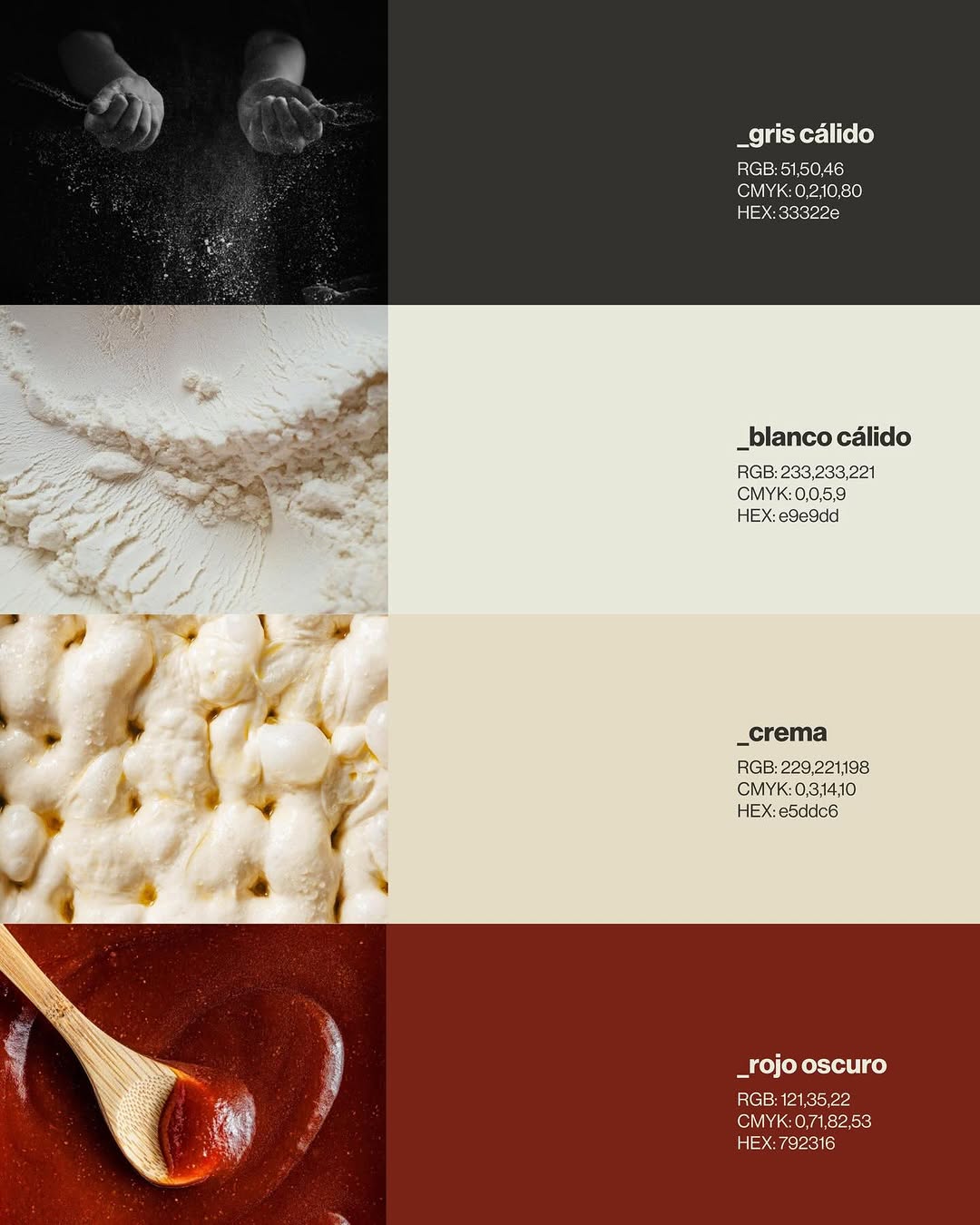
[ Naming + Branding Project ] NOLI — CDMX (Mexico)
Logo / Identidad / Colores / Tipografías / Texturas / Patterns
Prossimamente en Chicago 113, Esq Av. del Parque, Nápoles📍
21 May 2026spotted via @ten.10.design
Brand crush
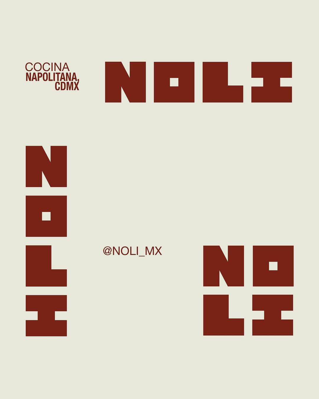
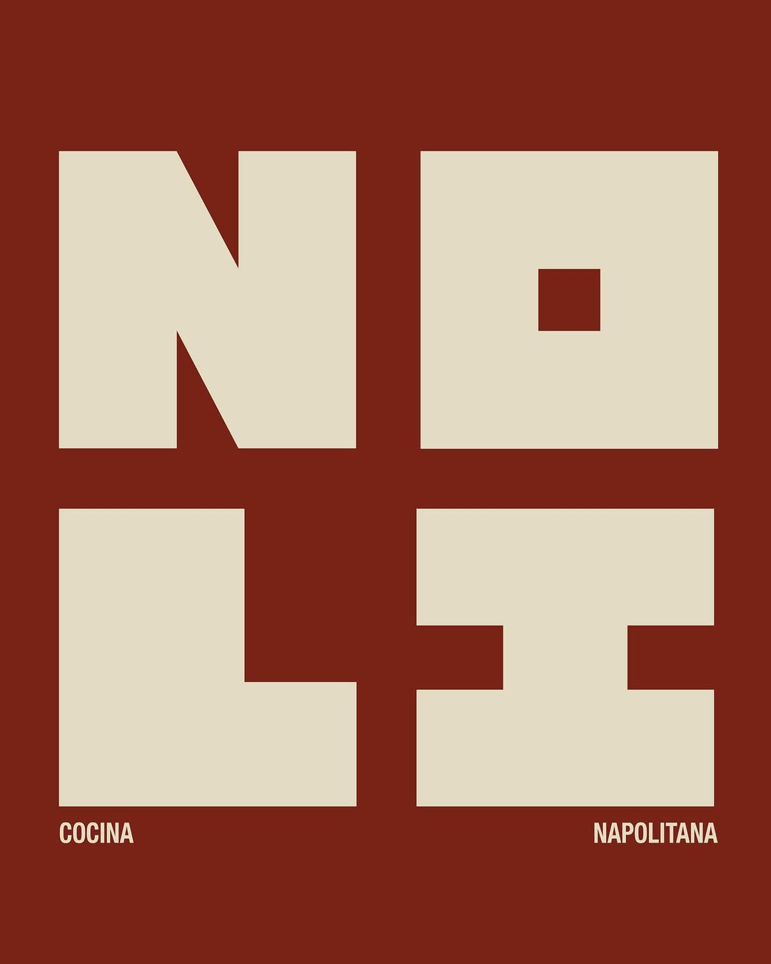
[ Naming + Branding Project ] NOLI — CDMX (Mexico)
Logo / Identidad / Colores / Tipografías / Texturas / Patterns
Prossimamente en Chicago 113, Esq Av. del Parque, Nápoles📍
More moments worth a look.

The heavy dark green fabric acts as an anchor for a massive, tonal flood of lighter green ink, pushing the actual text into a tiny top corner. By letting organic shapes dominate the real estate rather than a logo, the bag reads like a retail piece rather than a corporate giveaway.

The depth of the cast metal and the shadows pooling in the recesses of the shield do the heavy lifting here. By rendering a modern campaign graphic as a heavy physical crest, they manufacture instant multi-generational heritage without printing a single word.
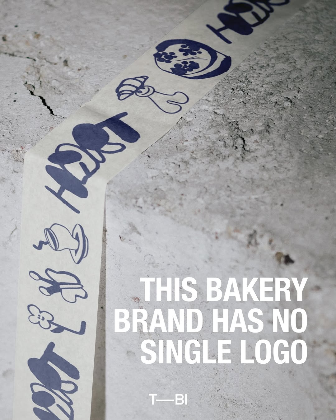
They ditched the static corporate stamp for a family of loose, single-colour illustrations printed on natural paper tape. It turns functional packaging into a living pattern that feels human and completely unbothered.
Ask Findie for a quick conversation, or hand the brief to Susan and the team. Either works.