Brand crush
gonnnnzzzzalo
Identity by @gonnnnzzzzalo
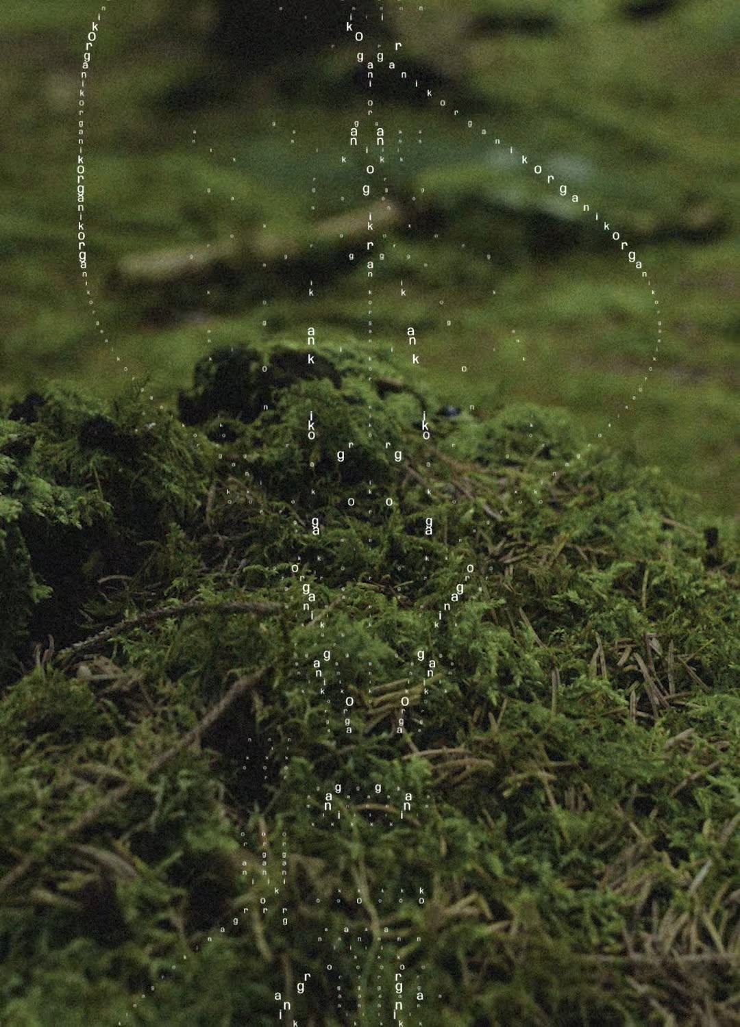
#textural-monochromeorganic topography, textural depth, monochromatic, quiet
Notice the deep shadows cutting across the sunlit crests of the grass. Relying on organic texture and natural light rather than heavy ink floods gives a surface an inherent, quiet weight.
The portable idea
Catching the light across a textured surface does more for a brand than flooding it with flat colour. When you lean into a single tone and let the material's natural grain or weave create the contrast, the result feels less like a billboard and more like an object to be kept. It is a quiet confidence play.
20 May 2026spotted via @gonnnnzzzzalo